Building Cohesiveness & Maintaining High Adoption Rates
Building Cohesiveness & Maintaining High Adoption Rates

Standing out from the crowd while building creating visual harmony
The TL;DR
Our client, a life insurance provider, needed to modernize its application tool to align with a newly redesigned quoting platform. I led UX and UI efforts to redesign core application types—streamlining navigation, reducing friction, and giving financial professionals the flexibility to complete applications on their own terms. The result: a unified system built to improve completion times, reduce support calls, and reinforce a trusted digital ecosystem.
Our client, a life insurance provider, needed to modernize its application tool to align with a newly redesigned quoting platform. I led UX and UI efforts to redesign core application types—streamlining navigation, reducing friction, and giving financial professionals the flexibility to complete applications on their own terms. The result: a unified system built to improve completion times, reduce support calls, and reinforce a trusted digital ecosystem.
My Role
Led end-to-end UX and UI design for 3 application types across 60+ screens
Conducted user flow analysis, heuristic evaluation, and design validation
Delivered high-fidelity prototypes and documentation for handoff
Collaborated closely with a content designer, researcher, and design lead
Led end-to-end UX and UI design for 3 application types across 60+ screens
Conducted user flow analysis, heuristic evaluation, and design validation
Delivered high-fidelity prototypes and documentation for handoff
Collaborated closely with a content designer, researcher, and design lead
Background
Our client was preparing to launch a new quoting tool but faced fragmentation between it and their older life insurance application tool. Managed by a third party, the application tool lacked visual cohesion, had usability issues, and no longer reflected the company’s evolving product standards. Our challenge was to modernize the experience—visually and functionally—while creating a flexible, consistent system that supported both business goals and user needs.
Our client was preparing to launch a new quoting tool but faced fragmentation between it and their older life insurance application tool. Managed by a third party, the application tool lacked visual cohesion, had usability issues, and no longer reflected the company’s evolving product standards. Our challenge was to modernize the experience—visually and functionally—while creating a flexible, consistent system that supported both business goals and user needs.
Approach
Established Clear Objectives with Stakeholders
We began by aligning on a purpose statement that emphasized harmonizing the experience across platforms. I helped refine vague success criteria—like “positive feedback”—into measurable goals: reduced application time, retention of adoption rates, increased active users, and fewer support calls.

Diagnosed Experience Gaps with Limited Access
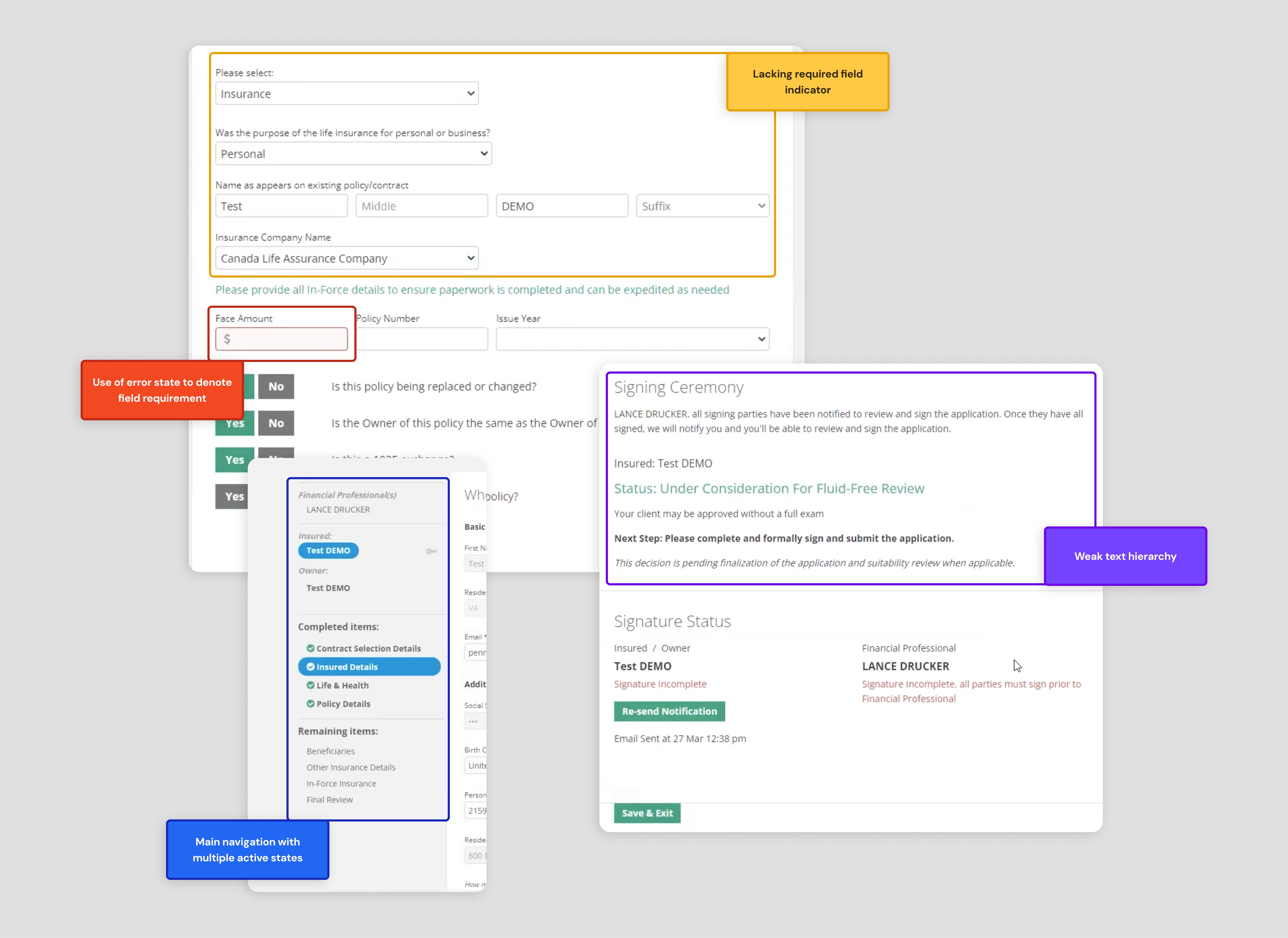
Initially, we couldn’t access the tool. I worked around this by annotating user flows from video walkthroughs to identify major pain points:
Required fields lacked visual indicators
Poor hierarchy made text-heavy pages hard to parse
Navigation behavior was inconsistent and confusing
These findings provided an early map of friction points to resolve in the redesign.
Validated Usability with a Focused Heuristic Review
Once we gained access to the tool, I led a targeted heuristic evaluation—scoped intentionally to be efficient but impactful. What made this analysis stand out was how collaboratively it was shaped. I partnered closely with our content strategist to ensure the evaluation addressed not just interaction design and visual hierarchy, but also language clarity and content usability.
Together, we selected four heuristics that allowed us to assess the experience from multiple angles: user control and freedom, consistency and standards, match between system and real-world expectations, and error recognition and recovery. This joint lens helped us go beyond the surface, identifying where ambiguous copy, visual clutter, or poor error handling created friction for financial professionals.
This collaboration bridged design and content seamlessly, giving us a more holistic view of the tool’s usability and laying the groundwork for clearer navigation, smarter defaults, and more intuitive guidance in the redesigned experience.


Uncovered a Need for Flexible, Nonlinear Workflows
Stakeholder interviews revealed that financial professionals didn’t work linearly. They jumped between application sections depending on task relevance. This insight shaped a new UX concept:
A personalized application landing page showed progress across all sections
Tabbed navigation enabled professionals to move freely across the tool
This approach balanced structure with flexibility, giving users control without losing clarity.


Built, Tested, and Refined with Financial Professionals
I developed high-fidelity designs across 11 core page types, each with multiple states and error conditions. We iterated through three internal design reviews, then validated concepts in sessions with real financial professionals—marking our first direct user engagement. Feedback confirmed that the new navigation and error handling significantly improved usability and reduced ambiguity.

Delivered Key Interface Transformations
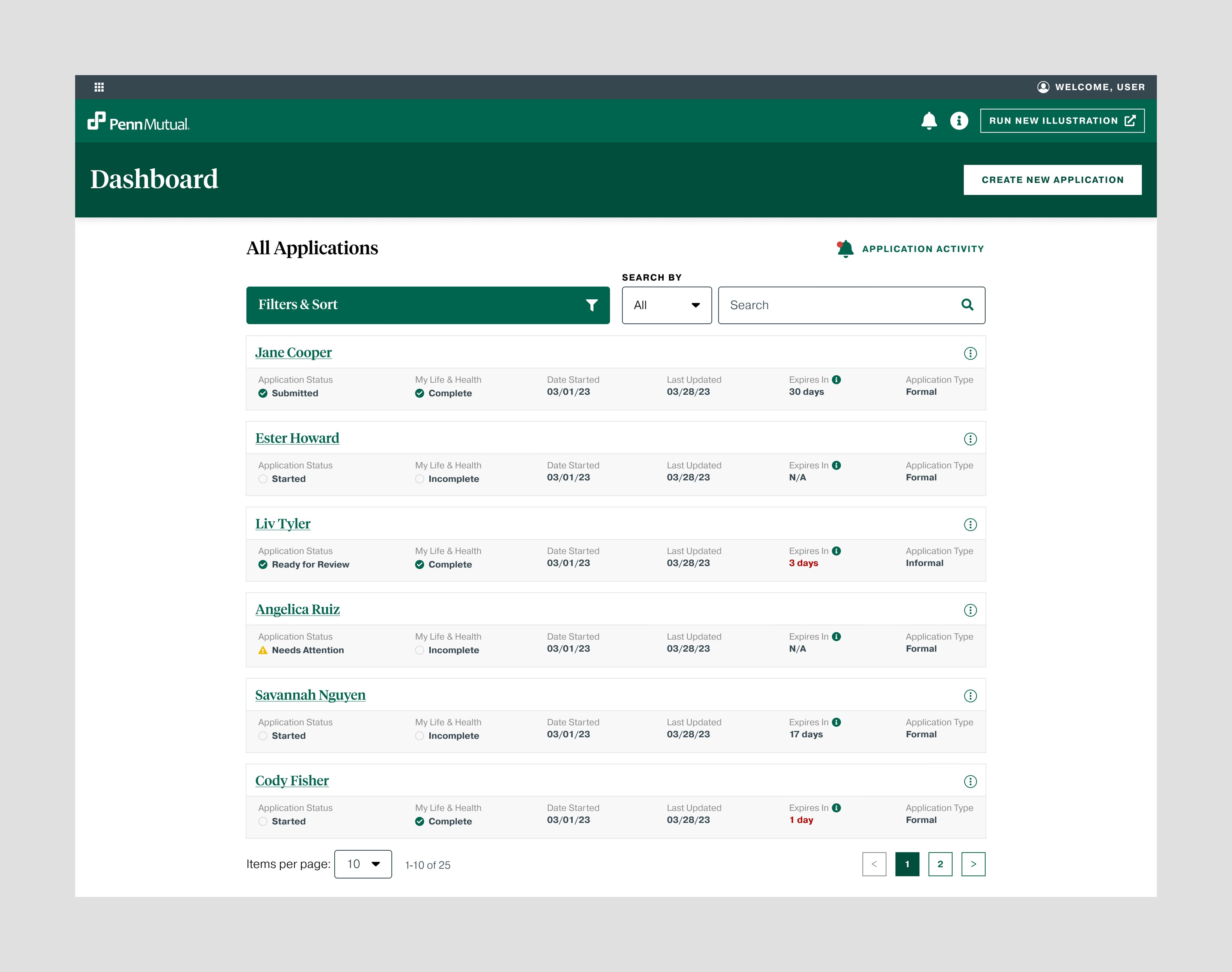
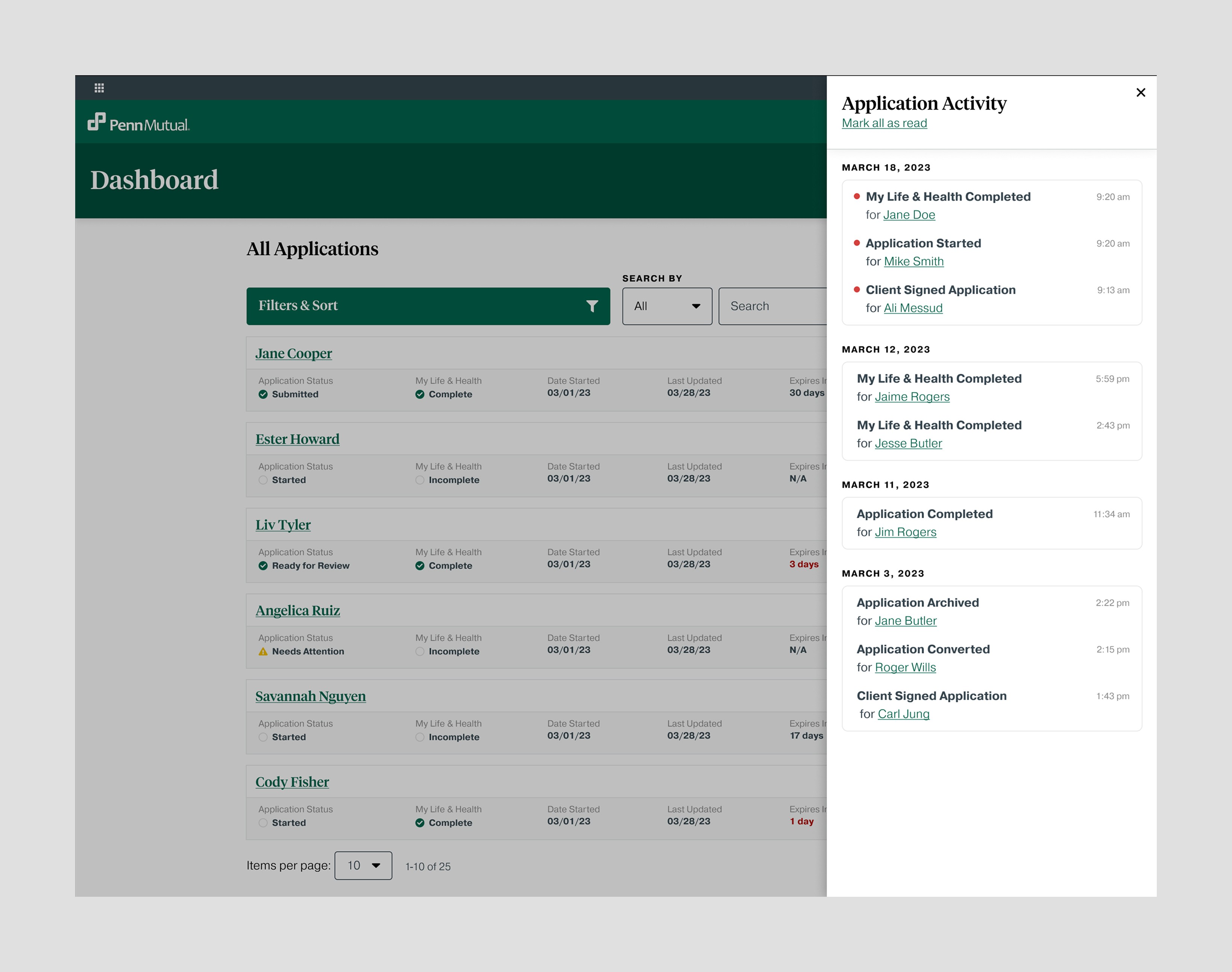
"My Applications" dashboard
Introduced an “Application Updates” panel and direct access to start an application
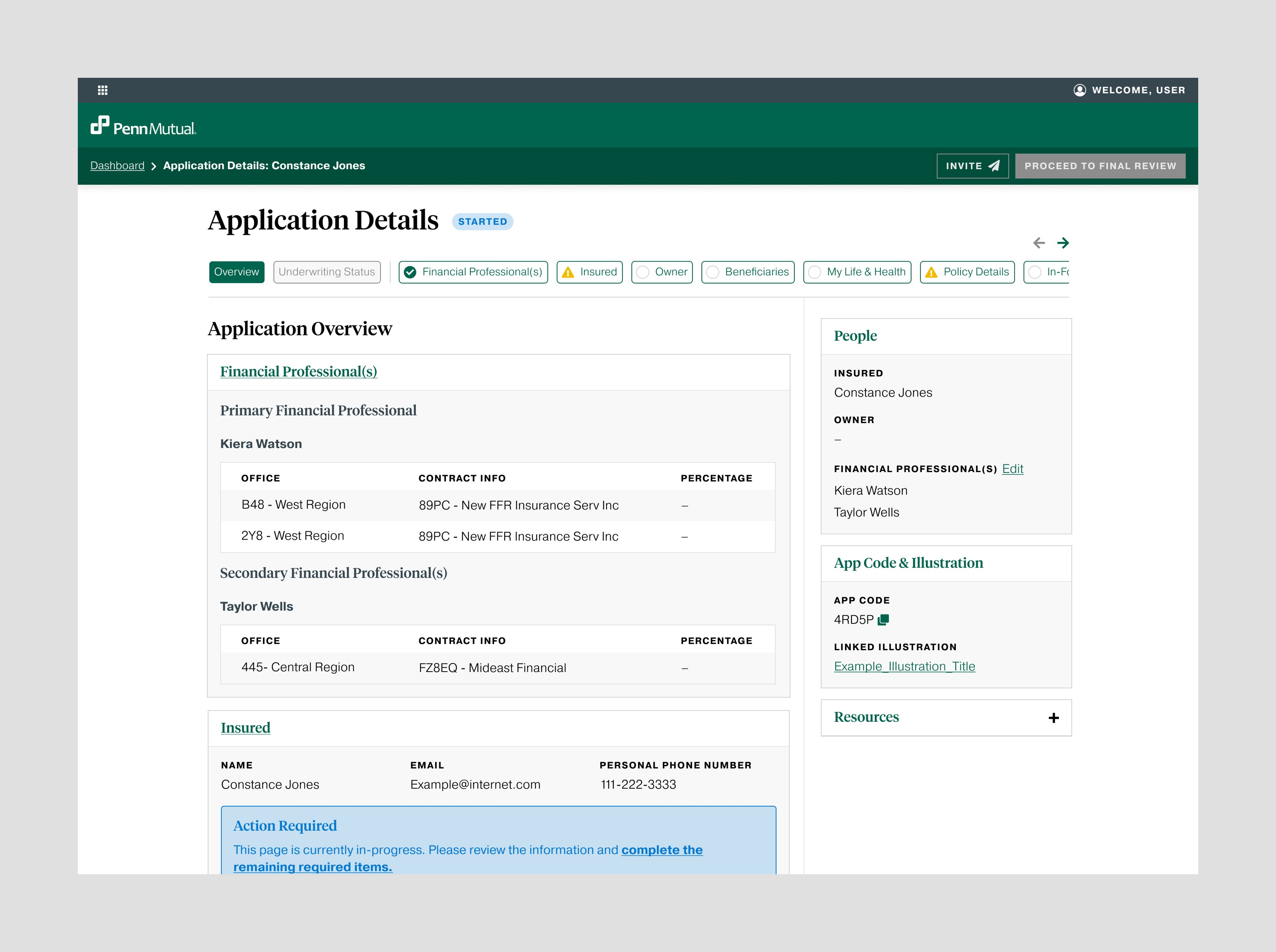
Application Overview for a "free-form" experience
Combined pre-filled data from quotes with visible progress indicators, breadcrumbs, and a right-hand help pane

Information Pages that were easier to digest
Improved hierarchy, clarified required fields, and introduced smart error handling that flagged issues in both navigation tabs and sidebar prompts


Established Clear Objectives with Stakeholders
We began by aligning on a purpose statement that emphasized harmonizing the experience across platforms. I helped refine vague success criteria—like “positive feedback”—into measurable goals: reduced application time, retention of adoption rates, increased active users, and fewer support calls.
Diagnosed Experience Gaps with Limited Access
Initially, we couldn’t access the tool. I worked around this by annotating user flows from video walkthroughs to identify major pain points:
Required fields lacked visual indicators
Poor hierarchy made text-heavy pages hard to parse
Navigation behavior was inconsistent and confusing
These findings provided an early map of friction points to resolve in the redesign.
Validated Usability with a Focused Heuristic Review
Once we gained access to the tool, I led a targeted heuristic evaluation—scoped intentionally to be efficient but impactful. What made this analysis stand out was how collaboratively it was shaped. I partnered closely with our content strategist to ensure the evaluation addressed not just interaction design and visual hierarchy, but also language clarity and content usability.
Together, we selected four heuristics that allowed us to assess the experience from multiple angles: user control and freedom, consistency and standards, match between system and real-world expectations, and error recognition and recovery. This joint lens helped us go beyond the surface, identifying where ambiguous copy, visual clutter, or poor error handling created friction for financial professionals.
This collaboration bridged design and content seamlessly, giving us a more holistic view of the tool’s usability and laying the groundwork for clearer navigation, smarter defaults, and more intuitive guidance in the redesigned experience.
Uncovered a Need for Flexible, Nonlinear Workflows
Stakeholder interviews revealed that financial professionals didn’t work linearly. They jumped between application sections depending on task relevance. This insight shaped a new UX concept:
A personalized application landing page showed progress across all sections
Tabbed navigation enabled professionals to move freely across the tool
This approach balanced structure with flexibility, giving users control without losing clarity.
Built, Tested, and Refined with Financial Professionals
I developed high-fidelity designs across 11 core page types, each with multiple states and error conditions. We iterated through three internal design reviews, then validated concepts in sessions with real financial professionals—marking our first direct user engagement. Feedback confirmed that the new navigation and error handling significantly improved usability and reduced ambiguity.
Delivered Key Interface Transformations
"My Applications" dashboard
Introduced an “Application Updates” panel and direct access to start an application
Application Overview for a "free-form" experience
Combined pre-filled data from quotes with visible progress indicators, breadcrumbs, and a right-hand help pane
Information Pages that were easier to digest
Improved hierarchy, clarified required fields, and introduced smart error handling that flagged issues in both navigation tabs and sidebar prompts
Outcome & Reflections
By rethinking how financial professionals navigate and complete applications, we created a tool that’s more intuitive, flexible, and aligned with the company’s broader ecosystem. While the product is still awaiting rollout, many of our designs were adopted by the client in late 2024, including the tabbed navigation and landing page model.
The work reflects the power of user-centered thinking—even with limited access and early ambiguity. Our cross-functional team delivered a solution that reduced friction, anticipated user needs, and laid the groundwork for a more cohesive digital experience. Most importantly, we turned what was once a disjointed, third-party tool into something Financial Professionals could trust and move through with confidence.
More work this way

Josh Stewart
Senior UX Designer, currently designing at Think Company.
Want to discuss an opportunity or let me pet your dog? Let’s chat.
me@jshstwrt.com
Email copied!
Josh Stewart
Senior UX Designer, currently designing at Think Company.
Want to discuss an opportunity or let me pet your dog? Let’s chat.
me@jshstwrt.com
Email copied!
Josh Stewart
Senior UX Designer, currently designing at Think Company.
Want to discuss an opportunity or let me pet your dog? Let’s chat.
me@jshstwrt.com
Email copied!