Creating a New, Scalable Payment Solutions Platform
Creating a New, Scalable Payment Solutions Platform

A next-gen fraud and payments experience grounded in user needs and enterprise growth
The TL;DR
Our client—a third-party logistics software provider—grew rapidly, but their tools lacked cohesion. I helped redesign their fraud and payments portals to bring consistency, clarity, and strategic feature integration to their platform. The goal: empower users to navigate a complex ecosystem with confidence and ease.
Our client—a third-party logistics software provider—grew rapidly, but their tools lacked cohesion. I helped redesign their fraud and payments portals to bring consistency, clarity, and strategic feature integration to their platform. The goal: empower users to navigate a complex ecosystem with confidence and ease.
My Role
Led IA and UX design strategy for fraud and payment portal consolidation
Introduced an object-oriented UX (OOUX) approach to redefine system structure
Created wireframes and a sitemap to guide rebranding and feature planning
Delivered documentation and a roadmap aligned with user needs and business goals
Background
The client offered a suite of tools for managing transaction data, but over time the ecosystem became inconsistent. While agile, their speed led to design fragmentation. Our challenge was to unify the two foundational parts of the current system but also deliver a scalable foundation for future growth.
The client offered a suite of tools for managing transaction data, but over time the ecosystem became inconsistent. While agile, their speed led to design fragmentation. Our challenge was to unify the two foundational parts of the current system but also deliver a scalable foundation for future growth.
Approach
Simplified the Structure with OOUX
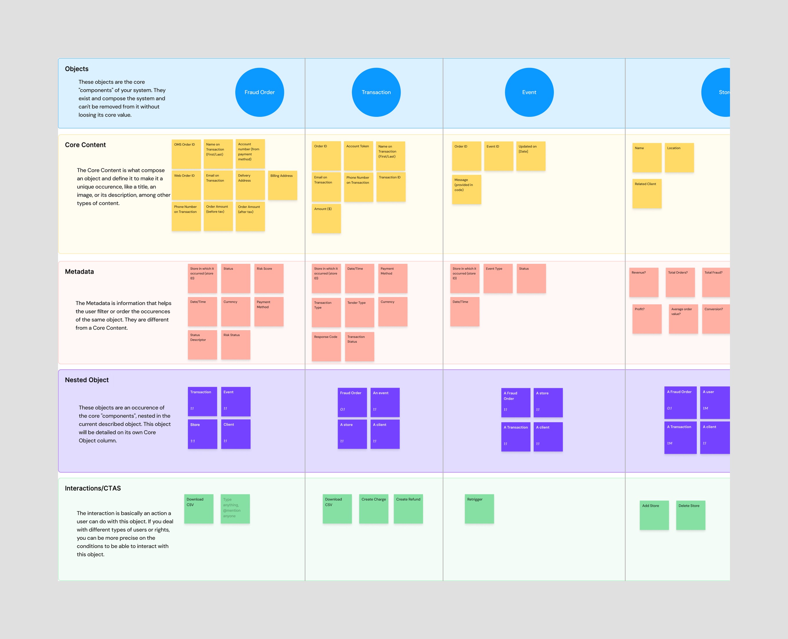
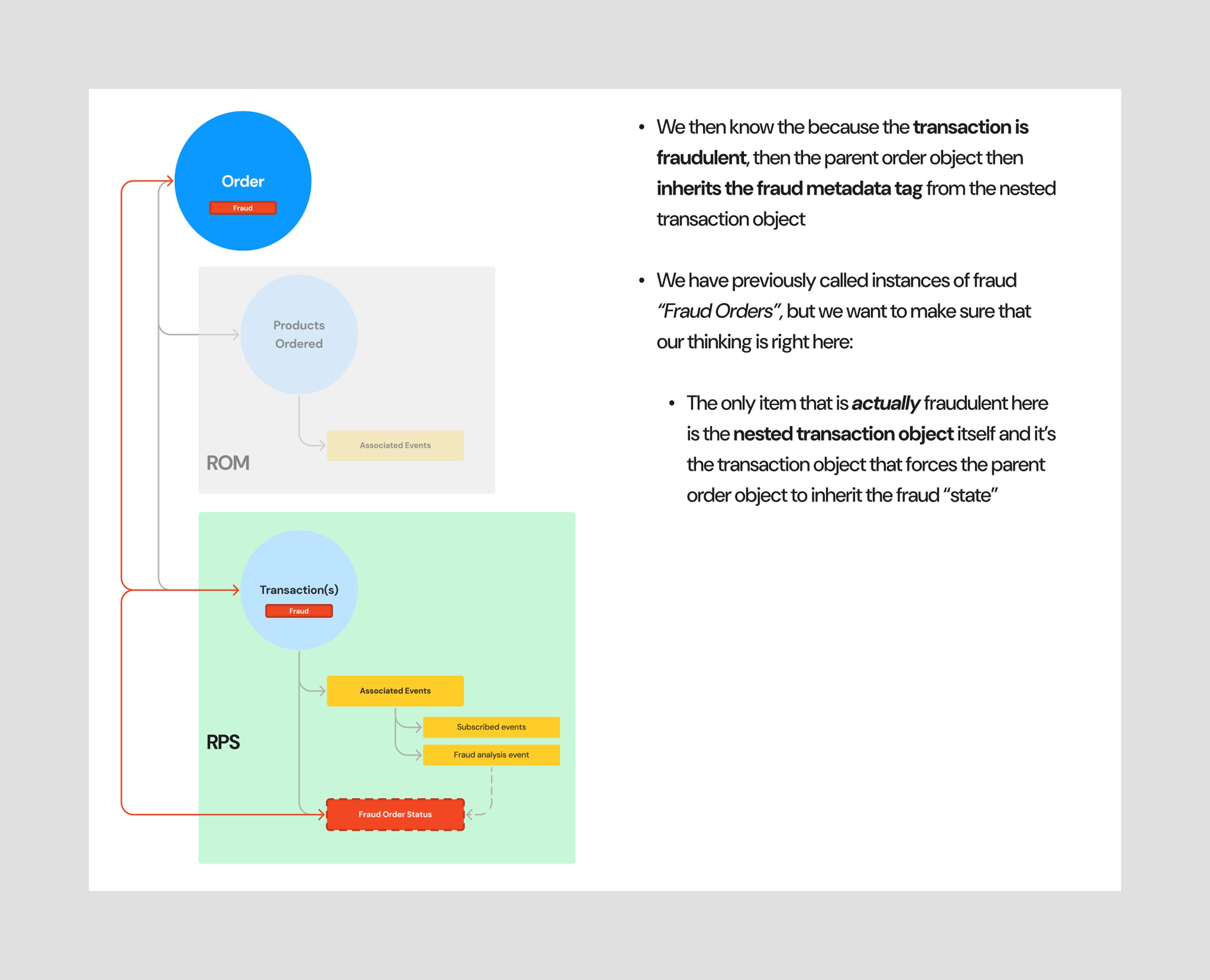
To build a more scalable system, I applied an Object-Oriented UX (OOUX) approach to audit and reorganize the platform’s information architecture. This method helped reveal structural inefficiencies hiding behind legacy navigation labels.
For example, I identified that “fraud” wasn’t a standalone section—it was simply metadata tied to transactions. By redefining it as a view within a consolidated “Transactions” object, I streamlined access and reduced complexity. Similar patterns emerged throughout the system, allowing us to collapse overlapping content and introduce clearer navigation points that reflected how users actually work.
I presented these findings in a collaborative walkthrough, allowing stakeholders to challenge, validate, and build on the object model. This shifted the conversation from reactive feature requests to strategic system design—and ultimately led to a 53% reduction in top-level navigation items, improving both usability and long-term scalability.
Mapped a Connected Ecosystem
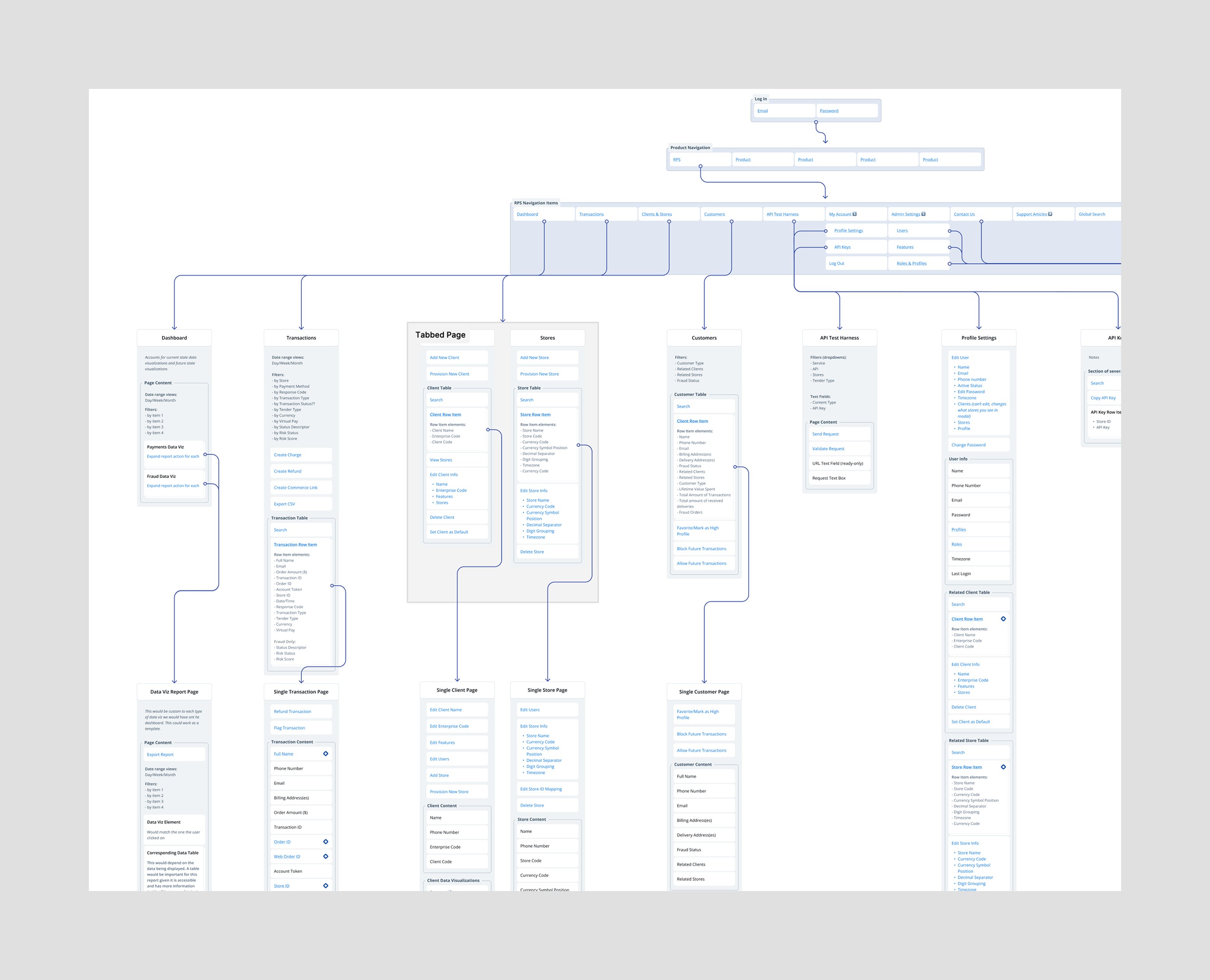
After restructuring the system with OOUX, I led the creation of a sitemap to visualize how users would navigate this new, simplified structure. This sitemap didn’t just outline page hierarchy—it showed how key objects and features connected across the platform, revealing dependencies, cross-navigation opportunities, and moments for contextual guidance.
It became a strategic tool for stakeholder alignment. We used it to map both existing and requested features to the right parts of the system, highlighting where consolidation or repositioning made sense. By shifting the focus from isolated pages to interconnected user flows, we created a clearer picture of how the platform could scale with purpose—supporting better task completion, easier orientation, and more intuitive feature discovery.
Prioritized User-First Features
With our new object-based foundation in place, I shifted focus to ensuring users could more easily access, understand, and act on critical information. My design decisions were driven by stakeholder requests, user expectations, and opportunities surfaced through OOUX and sitemap workshops.

Main & Secondary Navigation Redesign
The main navigation was streamlined to reflect key system objects—no longer cluttered with mismatched tools and settings. This reduced cognitive load and helped users find core areas like “Customers” and “Transactions” more intuitively. New sections such as “Admin Settings” supported requested functionality for managing stores, features, users, and roles.
To improve orientation and efficiency, I introduced a secondary navigation bar featuring breadcrumb navigation and a new global search tool—a significant addition that didn’t exist in the previous system. Previously, users were forced to navigate to multiple pages before they could begin searching for values. With the new search field always present, users could now directly query and access records—like a specific transaction ID or customer—without unnecessary steps. This saved time, reduced frustration, and empowered users to move faster through their daily workflows.
I also introduced a contextual “Create New” button, which dynamically adjusted to the page the user was viewing—making it seamless to initiate new tasks without breaking focus or backtracking.

Dashboard Enhancements
We unified fraud and payments dashboards under a single, tabbed layout—important since fraud is an add-on feature for select users. The design added trend indicators, clearer data visuals, and better text labels to help users interpret values without relying solely on visual cues. Hover states and accessible tables gave users clearer insight into patterns and issues over time.
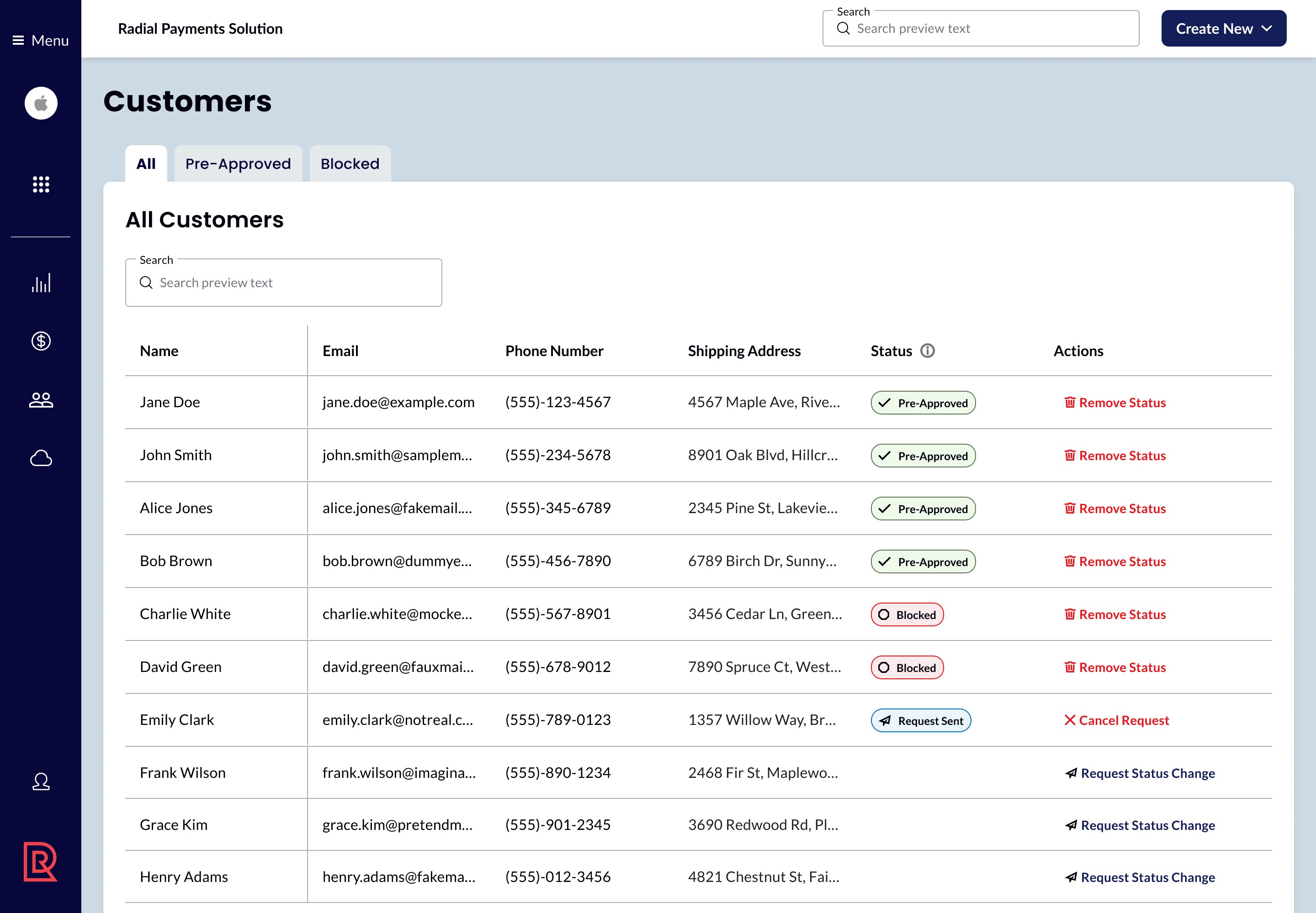
Customer Page Creation
Following our object-mapping efforts, we identified “Customer” as a new, first-class object—earning a dedicated navigation link. I designed a page with a tabbed table view separating pre-approved and blocked customers, addressing key user tasks. This let users proactively manage fraud risk by requesting approvals before purchases and blocking risky individuals, all from the same interface. Status indicators made customer states clear, and each record supported direct actions like unblocking or reversing approvals.

Transactions Redesign
What was once labeled “Orders” was reframed as “Transactions” to better reflect business language. This page brought together what had previously been split across fraud and payment tools.
I designed a tabbed table with fraud-specific visual indicators, improved filters, and the ability to save search parameters to create new user configured tabs—making recurring tasks faster and more efficient. Clicking a transaction opened a unified detail page, combining fraud and payment data with linked access to customer and store records. This fluid navigation allowed users to trace and resolve issues quickly without losing context.
Simplified the Structure with OOUX
To build a more scalable system, I applied an Object-Oriented UX (OOUX) approach to audit and reorganize the platform’s information architecture. This method helped reveal structural inefficiencies hiding behind legacy navigation labels.
For example, I identified that “fraud” wasn’t a standalone section—it was simply metadata tied to transactions. By redefining it as a view within a consolidated “Transactions” object, I streamlined access and reduced complexity. Similar patterns emerged throughout the system, allowing us to collapse overlapping content and introduce clearer navigation points that reflected how users actually work.
I presented these findings in a collaborative walkthrough, allowing stakeholders to challenge, validate, and build on the object model. This shifted the conversation from reactive feature requests to strategic system design—and ultimately led to a 53% reduction in top-level navigation items, improving both usability and long-term scalability.
Mapped a Connected Ecosystem
After restructuring the system with OOUX, I led the creation of a sitemap to visualize how users would navigate this new, simplified structure. This sitemap didn’t just outline page hierarchy—it showed how key objects and features connected across the platform, revealing dependencies, cross-navigation opportunities, and moments for contextual guidance.
It became a strategic tool for stakeholder alignment. We used it to map both existing and requested features to the right parts of the system, highlighting where consolidation or repositioning made sense. By shifting the focus from isolated pages to interconnected user flows, we created a clearer picture of how the platform could scale with purpose—supporting better task completion, easier orientation, and more intuitive feature discovery.
Prioritized User-First Features
With our new object-based foundation in place, I shifted focus to ensuring users could more easily access, understand, and act on critical information. My design decisions were driven by stakeholder requests, user expectations, and opportunities surfaced through OOUX and sitemap workshops.
Main & Secondary Navigation Redesign
The main navigation was streamlined to reflect key system objects—no longer cluttered with mismatched tools and settings. This reduced cognitive load and helped users find core areas like “Customers” and “Transactions” more intuitively. New sections such as “Admin Settings” supported requested functionality for managing stores, features, users, and roles.
To improve orientation and efficiency, I introduced a secondary navigation bar featuring breadcrumb navigation and a new global search tool—a significant addition that didn’t exist in the previous system. Previously, users were forced to navigate to multiple pages before they could begin searching for values. With the new search field always present, users could now directly query and access records—like a specific transaction ID or customer—without unnecessary steps. This saved time, reduced frustration, and empowered users to move faster through their daily workflows.
I also introduced a contextual “Create New” button, which dynamically adjusted to the page the user was viewing—making it seamless to initiate new tasks without breaking focus or backtracking.
Dashboard Enhancements
We unified fraud and payments dashboards under a single, tabbed layout—important since fraud is an add-on feature for select users. The design added trend indicators, clearer data visuals, and better text labels to help users interpret values without relying solely on visual cues. Hover states and accessible tables gave users clearer insight into patterns and issues over time.
Customer Page Creation
Following our object-mapping efforts, we identified “Customer” as a new, first-class object—earning a dedicated navigation link. I designed a page with a tabbed table view separating pre-approved and blocked customers, addressing key user tasks. This let users proactively manage fraud risk by requesting approvals before purchases and blocking risky individuals, all from the same interface. Status indicators made customer states clear, and each record supported direct actions like unblocking or reversing approvals.
Transactions Redesign
What was once labeled “Orders” was reframed as “Transactions” to better reflect business language. This page brought together what had previously been split across fraud and payment tools.
I designed a tabbed table with fraud-specific visual indicators, improved filters, and the ability to save search parameters to create new user configured tabs—making recurring tasks faster and more efficient. Clicking a transaction opened a unified detail page, combining fraud and payment data with linked access to customer and store records. This fluid navigation allowed users to trace and resolve issues quickly without losing context.
Outcome & Reflections
The redesign wasn’t just about visual polish—it was about clarity, scalability, and user empowerment. Our work:
Reduced cognitive load across critical workflows
Streamlined navigation to reduce time-to-task
Created a shared language and structure for future feature growth
Though still in development, our foundational work has positioned the client to move faster and build more cohesively moving forward. This project reminded me how aligning IA with real-world use is one of the most impactful things we can do as designers.
More work this way


Josh Stewart
Senior UX Designer, currently designing at Think Company.
Want to discuss an opportunity or let me pet your dog? Let’s chat.
me@jshstwrt.com
Email copied!
Josh Stewart
Senior UX Designer, currently designing at Think Company.
Want to discuss an opportunity or let me pet your dog? Let’s chat.
me@jshstwrt.com
Email copied!
Josh Stewart
Senior UX Designer, currently designing at Think Company.
Want to discuss an opportunity or let me pet your dog? Let’s chat.
me@jshstwrt.com
Email copied!