Minimizing Friction, Maximizing Engagement for HCPs
Minimizing Friction, Maximizing Engagement for HCPs

A medical resources platform to help healthcare providers find, trust, and share content faster.
The TL;DR
Our client set out to transform an underdeveloped medical resources platform into a differentiated experience for healthcare providers (HCPs). I led the UX design for key content pages, shaping a system that surfaces information quickly, supports flexible content engagement, and builds trust. The result: a modern, intuitive platform designed to meet the time constraints and high expectations of busy providers.
Our client set out to transform an underdeveloped medical resources platform into a differentiated experience for healthcare providers (HCPs). I led the UX design for key content pages, shaping a system that surfaces information quickly, supports flexible content engagement, and builds trust. The result: a modern, intuitive platform designed to meet the time constraints and high expectations of busy providers.
My Role
Led UX design for key experience flows and UI patterns
Facilitated a Jobs-to-Be-Done workshop and prioritized features with stakeholders
Translated user research into actionable interface enhancements
Designed, iterated, and documented features for client handoff
Led UX design for key experience flows and UI patterns
Facilitated a Jobs-to-Be-Done workshop and prioritized features with stakeholders
Translated user research into actionable interface enhancements
Designed, iterated, and documented features for client handoff
Background
The existing platform lacked depth and failed to meet the evolving needs of HCPs. With limited filtering, sparse media types, and an underutilized logged-in experience, the tool provided little value beyond static content. Our client wanted to position this redesigned site as a market differentiator that offered medical professionals a seamless, personalized, and credible experience.
The existing platform lacked depth and failed to meet the evolving needs of HCPs. With limited filtering, sparse media types, and an underutilized logged-in experience, the tool provided little value beyond static content. Our client wanted to position this redesigned site as a market differentiator that offered medical professionals a seamless, personalized, and credible experience.
Approach
Grounded in Real-World Needs
We began with a Jobs-to-Be-Done workshop to better understand the specific needs of HCPs. Because we couldn't speak to users directly, we collaborated closely with stakeholders and leveraged research from a third-party vendor. From this, five critical user needs emerged:
Fast, frictionless access to relevant content
HCPs do not have a lot of free time due to the conditions of their profession, so getting them relevant content quickly is important
Flexibility to consume information in different formats
Due to their time constraints, not all HCPs have time to sit down in read articles so many prefer to consume content in more passive situations like driving to work
Supporting materials to deepen learning
If content draws an HCP in, they were curious about other resources that might be useful pertaining to the topic
Signals of trust to reduce perceived bias
HCPs know that the content is on a branded site and they want ways to circumnavigate the feeling of bias so they can trust the material
Ability to share valuable content with peers
HCPs not only want to better inform themselves, but they often have a network of fellow HCPs they socialize resources with

Feature Strategy Aligned to Insight
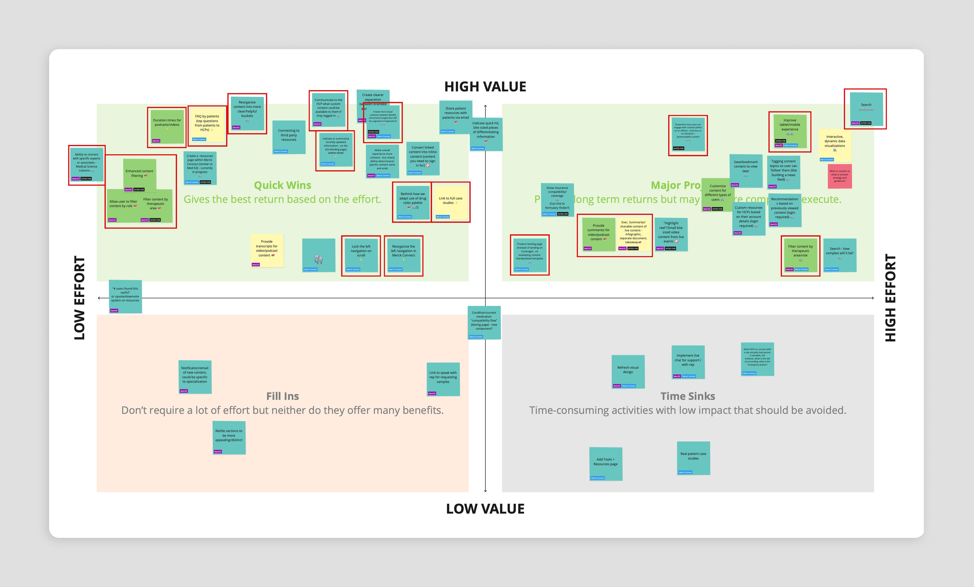
We translated these needs into strategic features, balancing stakeholder requests with user value. With an effort–value matrix, we collaboratively prioritized high-impact additions:
Advanced Filtering & Search:
Reduce time to content
Media Summaries & Video Chapters:
Provide flexible entry points and quick snippets of content
Supporting Downloads & Related Articles:
Extend value beyond videos and build ecosystem of resources
Most Played Heatmaps & Popular Tags:
Reinforce trust through peer activity
Content Bookmarking & Sharing:
Empower collaboration across peers
Design Highlights

Landing Page: Built for Speed & Personalization
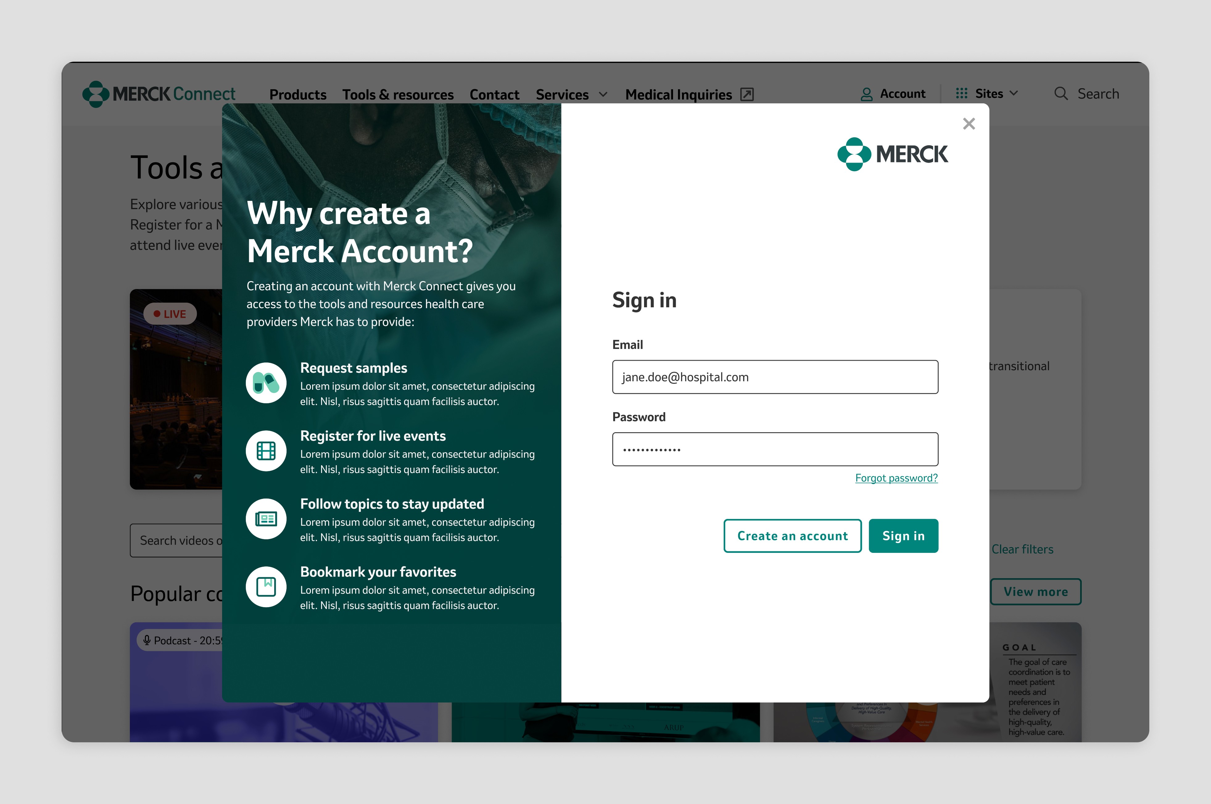
I introduced advanced filtering (search, sorting, and topic filters), improved content card clarity, and added grouped sections like "Popular" and "New." Logged-in users could now see bookmarks and followed topics, creating a more personalized experience.

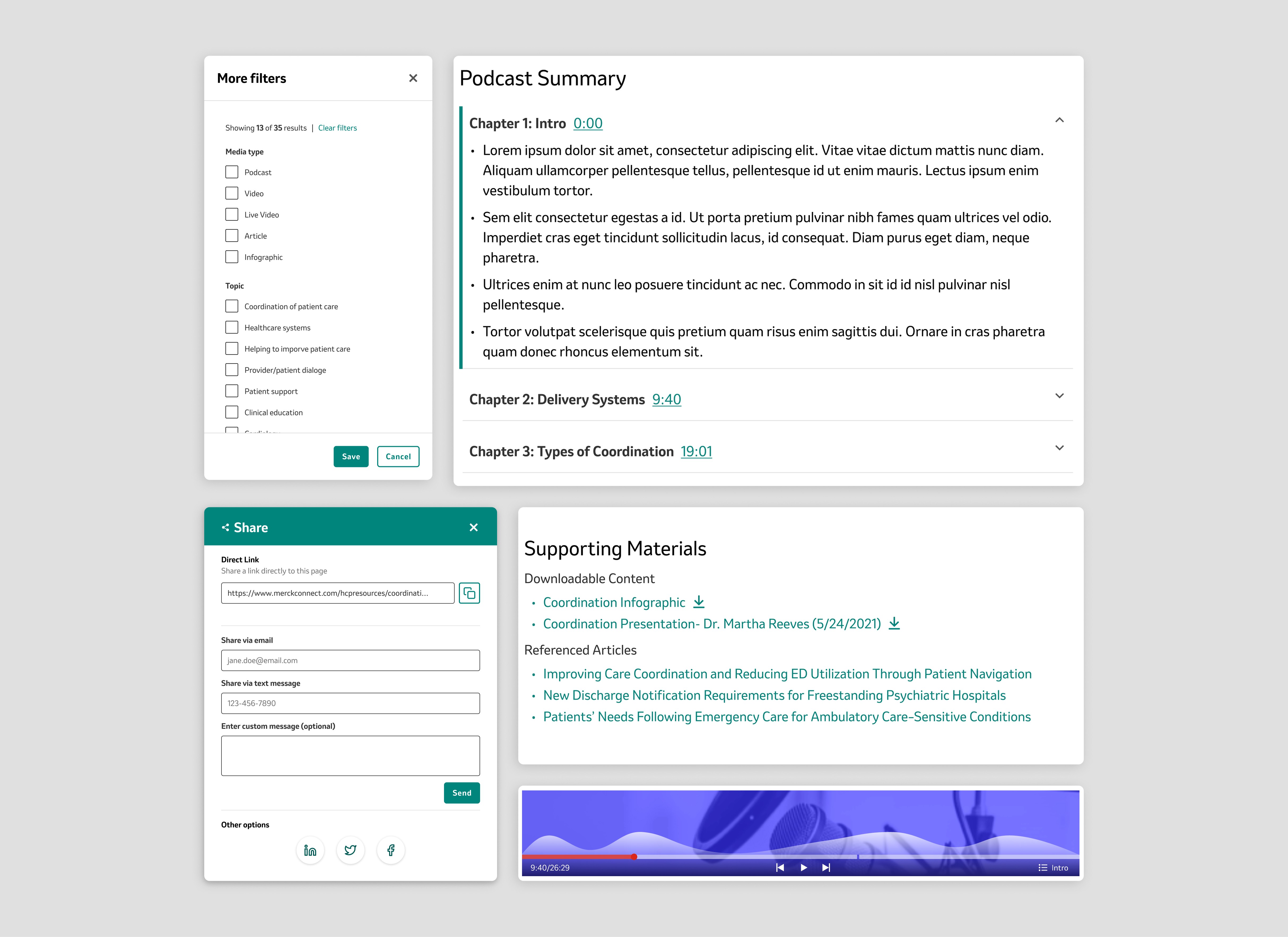
Media Page: Designed for Trust & Efficiency
Each video included a chapter selector, brief summaries, and a "Most Played" heatmap. Users could tag-hop, download supporting materials, or explore similar videos through an "Up Next" module—all while avoiding the burden of excessive clicking.


Events Page: Flexibility First
A hero section highlighted new livestream events with simplified registration cards. These changes aligned with HCPs' desire for time-flexible access and reduced the need for in-person participation.
Amplifying Impact Through Interactive Documentation
To support our stakeholder in socializing the work internally, I partnered with another designer to build an interactive documentation prototype. This gave stakeholders a hands-on way to explore the final designs and understand the thinking behind each decision. Hover-based annotations allowed viewers to uncover the rationale, insights, and design themes at their own pace—creating transparency, fostering alignment, and enabling our stakeholder to confidently advocate for the work across the organization.


Grounded in Real-World Needs
We began with a Jobs-to-Be-Done workshop to better understand the specific needs of HCPs. Because we couldn't speak to users directly, we collaborated closely with stakeholders and leveraged research from a third-party vendor. From this, five critical user needs emerged:
Fast, frictionless access to relevant content
HCPs do not have a lot of free time due to the conditions of their profession, so getting them relevant content quickly is important
Flexibility to consume information in different formats
Due to their time constraints, not all HCPs have time to sit down in read articles so many prefer to consume content in more passive situations like driving to work
Supporting materials to deepen learning
If content draws an HCP in, they were curious about other resources that might be useful pertaining to the topic
Signals of trust to reduce perceived bias
HCPs know that the content is on a branded site and they want ways to circumnavigate the feeling of bias so they can trust the material
Ability to share valuable content with peers
HCPs not only want to better inform themselves, but they often have a network of fellow HCPs they socialize resources with
Feature Strategy Aligned to Insight
We translated these needs into strategic features, balancing stakeholder requests with user value. With an effort–value matrix, we collaboratively prioritized high-impact additions:
Advanced Filtering & Search:
Reduce time to content
Media Summaries & Video Chapters:
Provide flexible entry points and quick snippets of content
Supporting Downloads & Related Articles:
Extend value beyond videos and build ecosystem of resources
Most Played Heatmaps & Popular Tags:
Reinforce trust through peer activity
Content Bookmarking & Sharing:
Empower collaboration across peers
Design Highlights
Landing Page: Built for Speed & Personalization
I introduced advanced filtering (search, sorting, and topic filters), improved content card clarity, and added grouped sections like "Popular" and "New." Logged-in users could now see bookmarks and followed topics, creating a more personalized experience.
Media Page: Designed for Trust & Efficiency
Each video included a chapter selector, brief summaries, and a "Most Played" heatmap. Users could tag-hop, download supporting materials, or explore similar videos through an "Up Next" module—all while avoiding the burden of excessive clicking.
Events Page: Flexibility First
A hero section highlighted new livestream events with simplified registration cards. These changes aligned with HCPs' desire for time-flexible access and reduced the need for in-person participation.
Amplifying Impact Through Interactive Documentation
To support our stakeholder in socializing the work internally, I partnered with another designer to build an interactive documentation prototype. This gave stakeholders a hands-on way to explore the final designs and understand the thinking behind each decision. Hover-based annotations allowed viewers to uncover the rationale, insights, and design themes at their own pace—creating transparency, fostering alignment, and enabling our stakeholder to confidently advocate for the work across the organization.
Outcome & Reflections
This redesign was never about just "making it prettier"; it was about deeply rethinking how HCPs discover, consume, and trust information. Our team delivered a solution that:
Reduced friction to access essential content
Supported multiple ways to engage with medical media
Provided peer-driven signals to counteract bias
Encouraged sharing to amplify trusted learning
Although the project wasn’t developed, it laid a strong strategic and visual foundation. With the right investment in development and validation, the platform can evolve into a truly differentiated experience for healthcare professionals.
More work this way


Josh Stewart
Senior UX Designer, currently designing at Think Company.
Want to discuss an opportunity or let me pet your dog? Let’s chat.
me@jshstwrt.com
Email copied!
Josh Stewart
Senior UX Designer, currently designing at Think Company.
Want to discuss an opportunity or let me pet your dog? Let’s chat.
me@jshstwrt.com
Email copied!
Josh Stewart
Senior UX Designer, currently designing at Think Company.
Want to discuss an opportunity or let me pet your dog? Let’s chat.
me@jshstwrt.com
Email copied!